CSAM-SMCA Was a Branding, Web Design & Development Project

The Brand Needed to Communicate:

Inclusivity

Wellness

Stature

Canadian

The Logo

CSAM-SMCA Regular Logo
CSAM-SMCA White Knockout Logo
CSAM-SMCA icon

The shape represents one blade of a Maple Leaf with the integrated continous line eluding to inclusivity and wellness.

Modern Serif Typeface
A modern serif gives the brand stature.

A subdued colour palette re-enforces the feeling of heritage while the pop of yellow prevents it from feeling stodgy.

Extending the Design System

The design system developed on the homepage was extended through the remainder of the site.

CSAM-SMCA what we do
CSAM-SMCA Job Opportunities
CSAM-SMCA Bylaws
CSAM-SMCA Blog Post User Profile
CSAM-SMCA sample blog post
CSAM-SMCA people

Desktop Layout

A subtle block system creates order to organize the various sections of information.

Homepage Scrolled
CSAM-SMCA Website Homepage Design
General Page
CSAM-SMCA Website Page Screenshot
Homepage Scrolled
CSAM-SMCA Website Page Homepage Scrolled
Blog
CSAM-SMCA Website Blog
Footer
CSAM-SMCA Website Footer
Minutes
CSAM-SMCA Website Minutes Design
previous arrowprevious arrow
next arrownext arrow

Mobile Layout

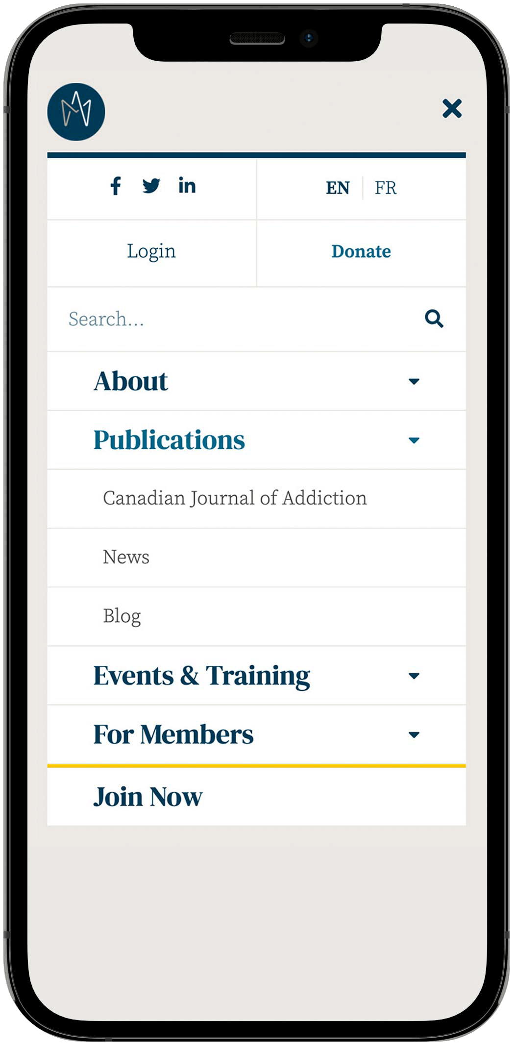
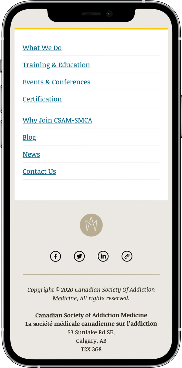
To preserve all the content on mobile, a full page menu slides in from the right.

CSAM-SMCA mobile homepage
CSAM-SMCA mobile menu

Email Newsletter

CSAM-SMCA Email Layouts

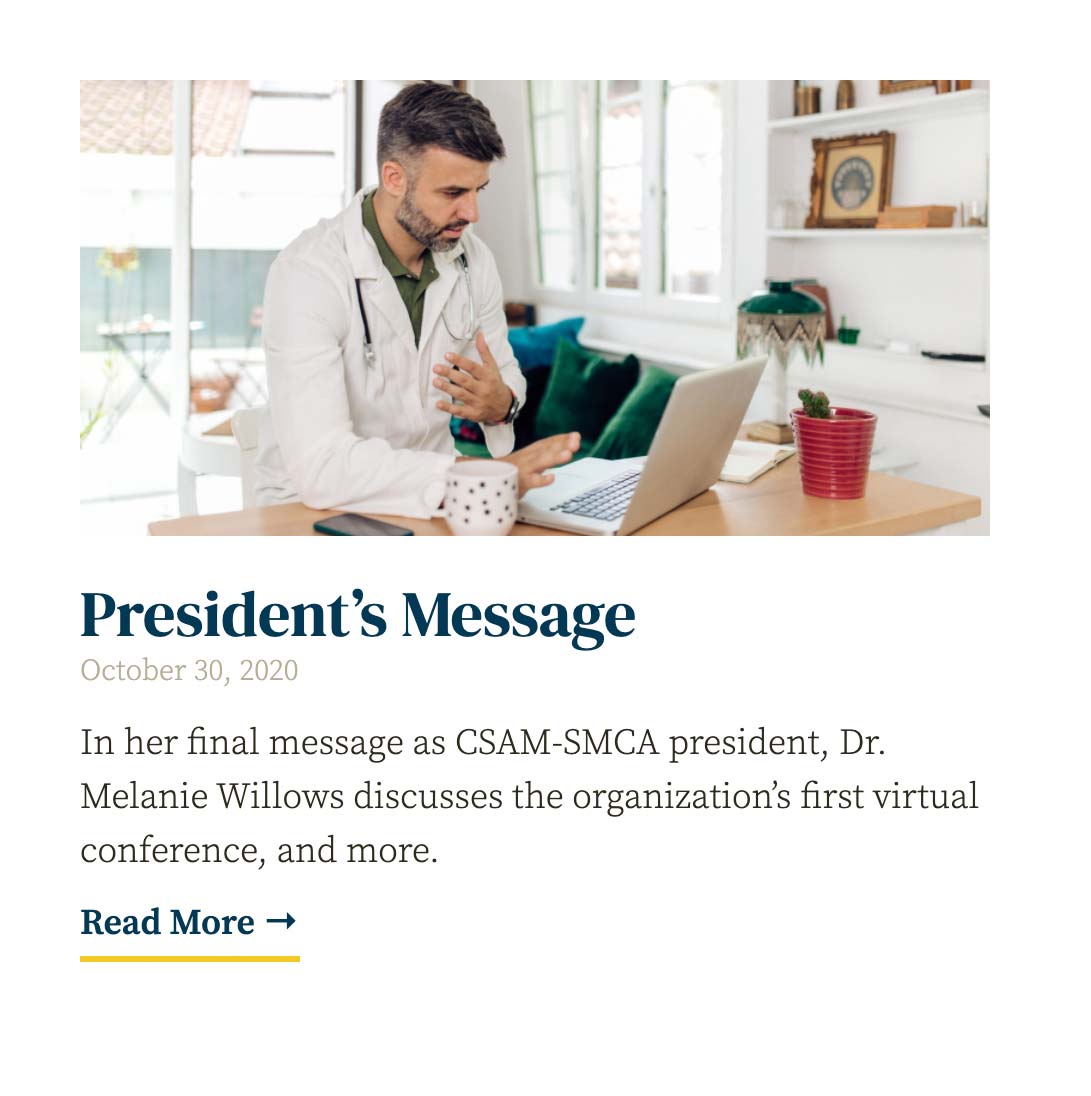
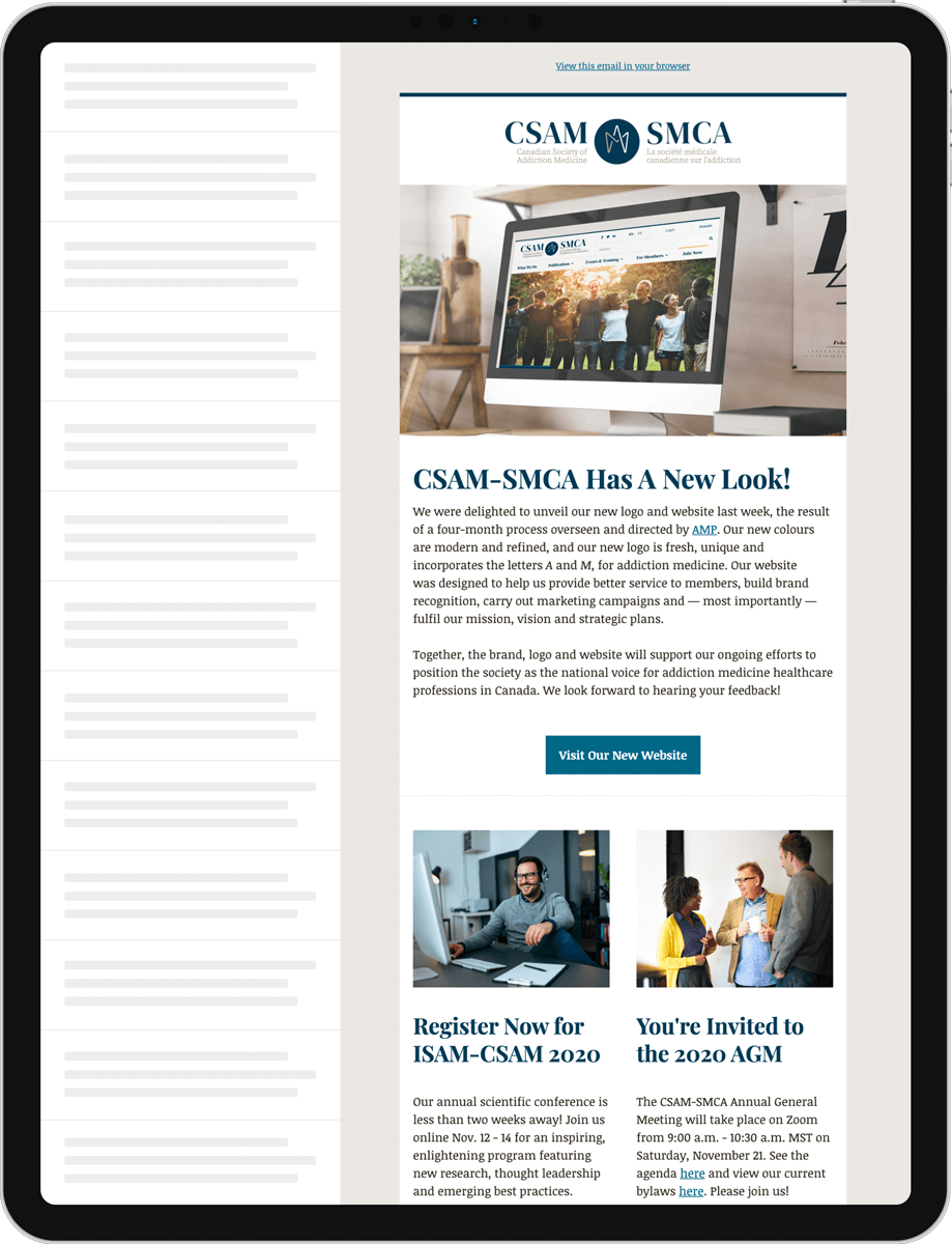
The design aesthetic was carried through to other touch points like their email newsletter.

Social Media

Social media is an important part of CSAM-SMCA’s strategy and so the brand style was carried through here as well.
CSAM-SMCA Social Media Layout

This project was developed in association with AMP.