Elite Trax Was a Website Redesign Project
Elite Trax is an international logistics corporation and wanted their website to reflect their global position.
Design Elements


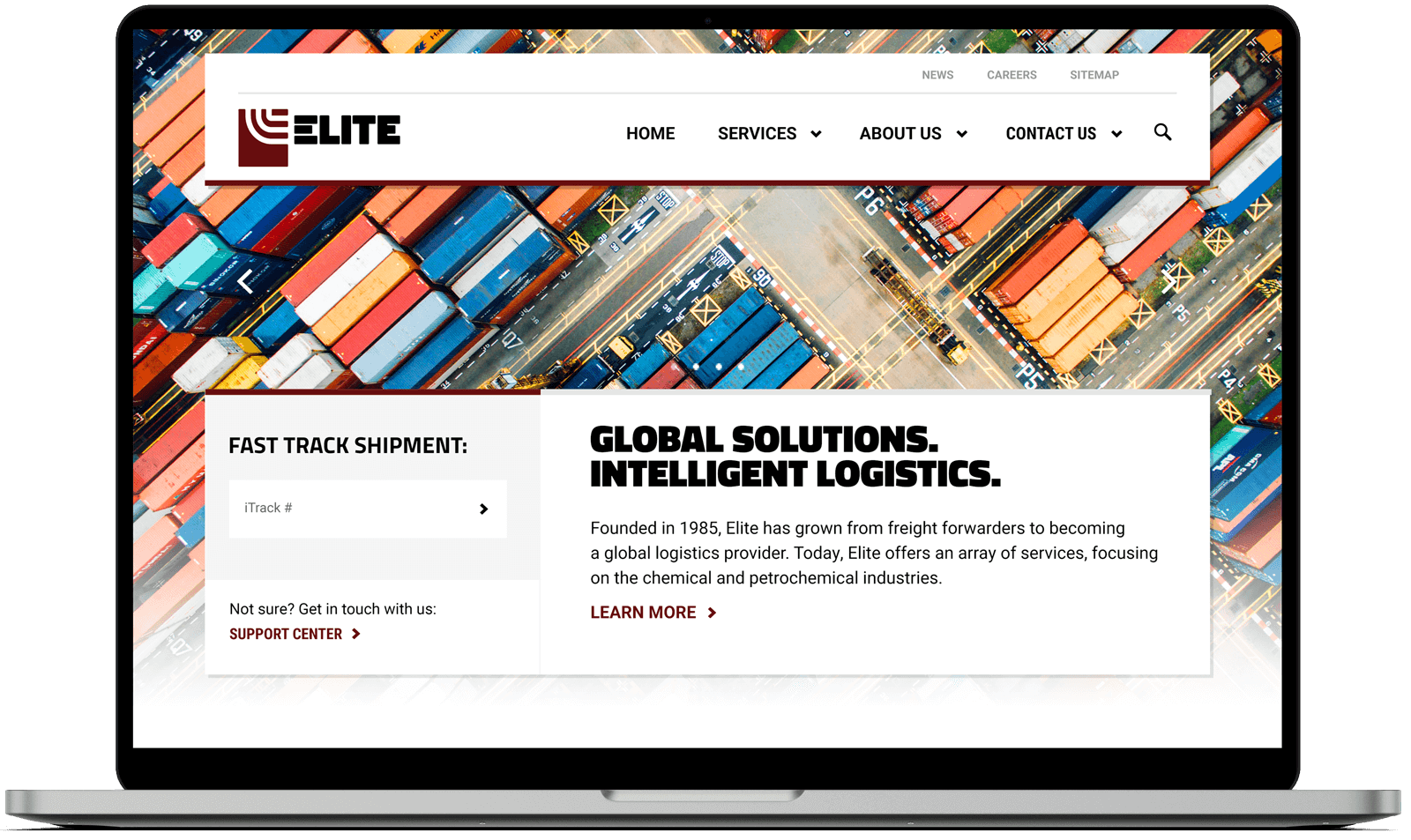
The headline font was selected to reflect the bold geometric typography of the logo and nature of business.
The body font needed to be clean and legible.
Vibrant and saturated photography brought life and interest to an industry perceived as dull.

The use of the chevron was integral to creating engagement on the site and inspired by the movement of logistics.
The colour palette was directly inspired by the brand.
Above the Fold

When landing on the website, the priorities were:
- A visual to communicate the industry.
- The ability to track a shipment.
- A quick introduction.
Mobile Layout
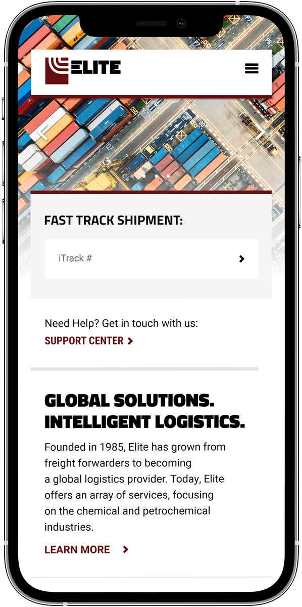
The content displayed on desktop is also all visible on mobile.
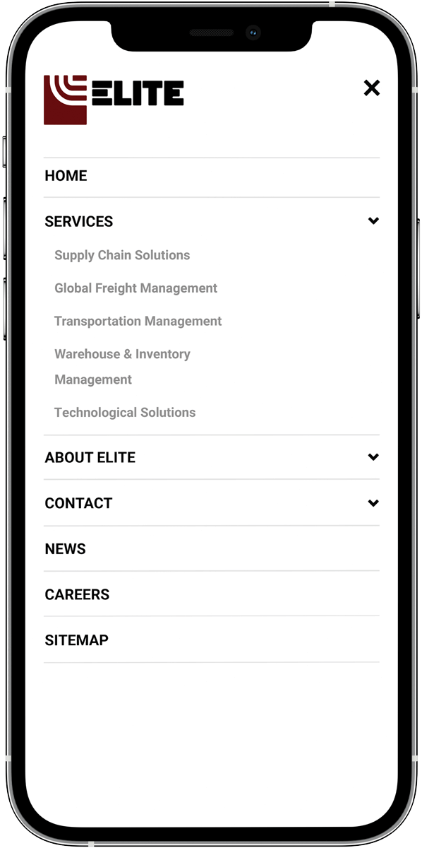
Because the site is large, the mobile menu is a full page takeover.


Additional Screenshots
The remainder of the homepage is broken down into sections highlighting the various aspects of the corporation.


